Exploratory Data Analysis - Visualization is Important!
About
This is the part of the R code for the CAP394 - Introduction to Data Science course.
In this document we'll show why visualization can give some insights on data.
Anscombe's Quartet Dataset
Let's explore some interesting features of Anscombe's quartet dataset, which have nearly identical descriptive statistics but have different distributions. The dataset is part of the datasets package, we don't need to read the data from an external source.
For our examples we will split it into four dataframes:
library(datasets)
str(anscombe)
## 'data.frame':	11 obs. of  8 variables:
##  $ x1: num  10 8 13 9 11 14 6 4 12 7 ...
##  $ x2: num  10 8 13 9 11 14 6 4 12 7 ...
##  $ x3: num  10 8 13 9 11 14 6 4 12 7 ...
##  $ x4: num  8 8 8 8 8 8 8 19 8 8 ...
##  $ y1: num  8.04 6.95 7.58 8.81 8.33 ...
##  $ y2: num  9.14 8.14 8.74 8.77 9.26 8.1 6.13 3.1 9.13 7.26 ...
##  $ y3: num  7.46 6.77 12.74 7.11 7.81 ...
##  $ y4: num  6.58 5.76 7.71 8.84 8.47 7.04 5.25 12.5 5.56 7.91 ...
# Let's reorg them into four data frames:
anscombe1 <- data.frame(anscombe$x1,anscombe$y1)
names(anscombe1) <- c("x","y")
anscombe2 <- data.frame(anscombe$x2,anscombe$y2)
names(anscombe2) <- c("x","y")
anscombe3 <- data.frame(anscombe$x3,anscombe$y3)
names(anscombe3) <- c("x","y")
anscombe4 <- data.frame(anscombe$x4,anscombe$y4)
names(anscombe4) <- c("x","y")
Basic Statistics on Anscombe's Quartet Dataset
Let's calculate and print some basic statistics -- first the mean values.
paste(mean(anscombe1$x),mean(anscombe1$y))
## [1] "9 7.50090909090909"
paste(mean(anscombe2$x),mean(anscombe2$y))
## [1] "9 7.50090909090909"
paste(mean(anscombe3$x),mean(anscombe3$y))
## [1] "9 7.5"
paste(mean(anscombe4$x),mean(anscombe4$y))
## [1] "9 7.50090909090909"
Now the standard deviations for both x and y.
paste(sd(anscombe1$x),sd(anscombe1$y))
## [1] "3.3166247903554 2.03156813592582"
paste(sd(anscombe2$x),sd(anscombe2$y))
## [1] "3.3166247903554 2.03165673550162"
paste(sd(anscombe3$x),sd(anscombe3$y))
## [1] "3.3166247903554 2.03042360112367"
paste(sd(anscombe4$x),sd(anscombe4$y))
## [1] "3.3166247903554 2.0305785113876"
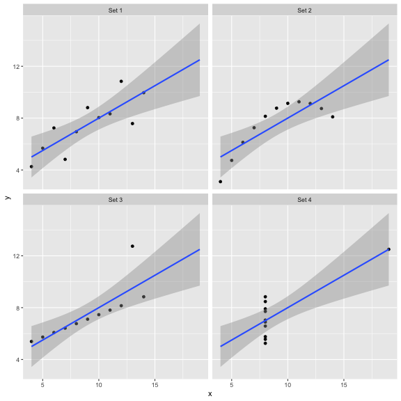
This dataset contains four sets of X and Y values, which have the same mean and standard deviations. One could guess that each one of the four datasets is statistically very similar to the others.
Are these datasets the same (minus some minor noise)? Best way to be sure is to plot them.
Anscombe's Quartet Dataset Basic Visualization
Let's plot a scatterplot (X-Y plot) for each of the four dataframes. Some nifty preprocessing allow us to make a fancy plot using ggplot2.
library(ggplot2)
# Let's add a label to each dataset.
anscombe1$i <- "Set 1"
anscombe2$i <- "Set 2"
anscombe3$i <- "Set 3"
anscombe4$i <- "Set 4"
# Now we can merge the datasets.
# https://stackoverflow.com/questions/16138693/rbind-multiple-data-sets
allData <- rbind(anscombe1,anscombe2,anscombe3,anscombe4)
# Create a plot with a linear regression plot over the points.
# https://stackoverflow.com/questions/15633714/adding-a-regression-line-on-a-ggplot
p <- ggplot(data = allData, aes(x = x, y = y)) + geom_point() +
     geom_smooth(method='lm',fullrange=TRUE)
# Plot wrapped using the i column.
# https://www3.nd.edu/~steve/computing_with_data/13_Facets/facets.html
p + facet_wrap(~i)

Conclusion: numbers can tell a lot, but sometimes it is better to see the data.
Exercises
Some people have too much fun with statistics. Check out the Datasaurus Dozen and try to reproduce the plots in this page with that data.
Warning: Code and results presented on this document are for reference use only. Code was written to be clear, not efficient. There are several ways to achieve the results, not all were considered.
See the R source code for this notebook.